GIMP Colour Exchange
Jibber Jabber
Only want instructions, skip the jibber jabber…
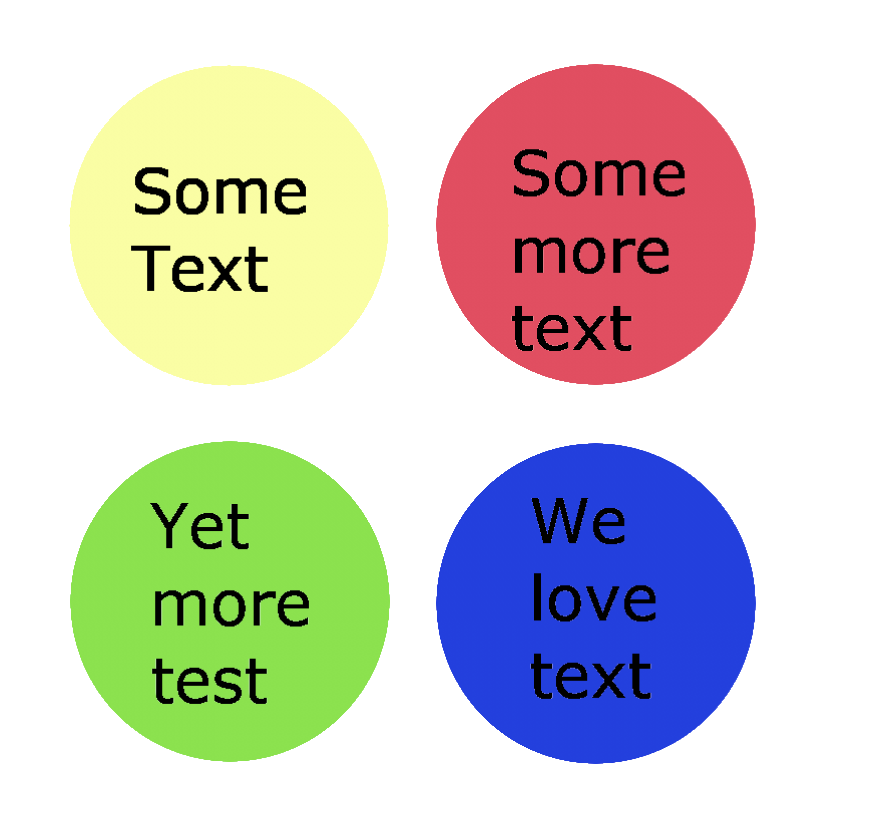
A friend recently asked for some advice regarding some colour combinations. Below is an example of what he showed us
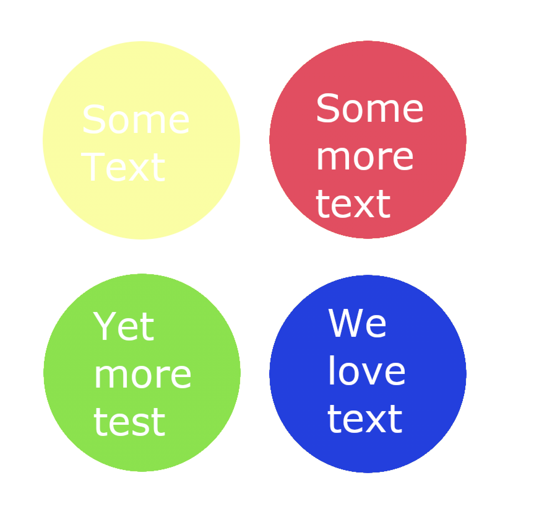
I gave my thoughts, namely that light text on the light background wasn’t a very easy to read combination and I suggested that maybe
You could do white or black text and get that “popping” effect on all colours.
Light text dark bg and vice versa.
The reply wasn’t exactly what I expected…
Brief aside, communication is hard at the best of times and when done via text can be even more difficult.

Taking a bit of time to think about what you’re writing and how you’re writing can go a long way. In fact, that was one of points I mentioned in my post about how to ask questions.
Brief aside…aside, I’ve recently been making quite a bit of use of the GNU Image Manipulation Program, or GIMP for short, so thought to pull together a quick mockup showing my friend what I had in mind.
Tutorial
Goal
What I wanted to do was change the white text to show black text, this type of change is pretty trivial if you have access to the text layers, but if you had a flattened PNG it’s a bit more difficult. Thankfully there is a filter which can be used to swap one colour for another.
Colour Exchange Filter
Accessed by choosing Colors -> Map -> Color Exchange
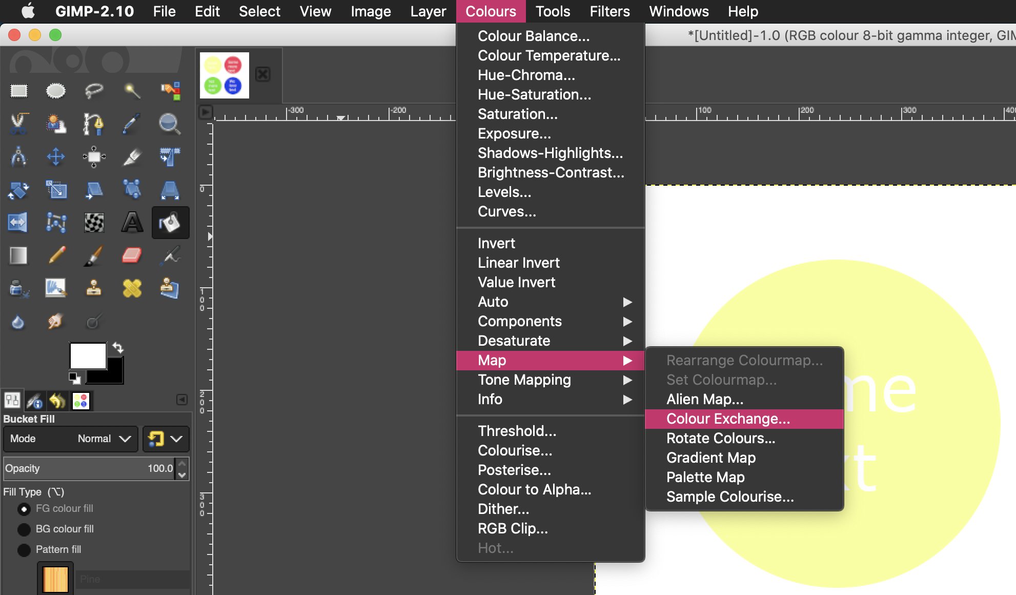
Opening up the colour exchange settings you’re greeted with a screen similar to this
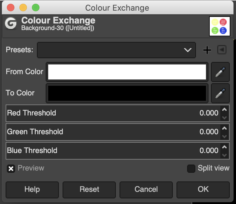
By default the tool opens up to replace white with black, for our efforts would almost be enough.
Colour Exchange Thresholds
But we can do better and it’s worth showing the power of the filter while I’m here.
Part of the artifacting that is visible is due to the fact the thresholds used on the tool are set to 0. In short, when you run the colour exchange filter, GIMP tries to replace one colour for the other and tries to account for minor colour variation based on the threshold you set.
When set at 0, it will only replace exact colour matches, taking a closer look at the lettering we see the following

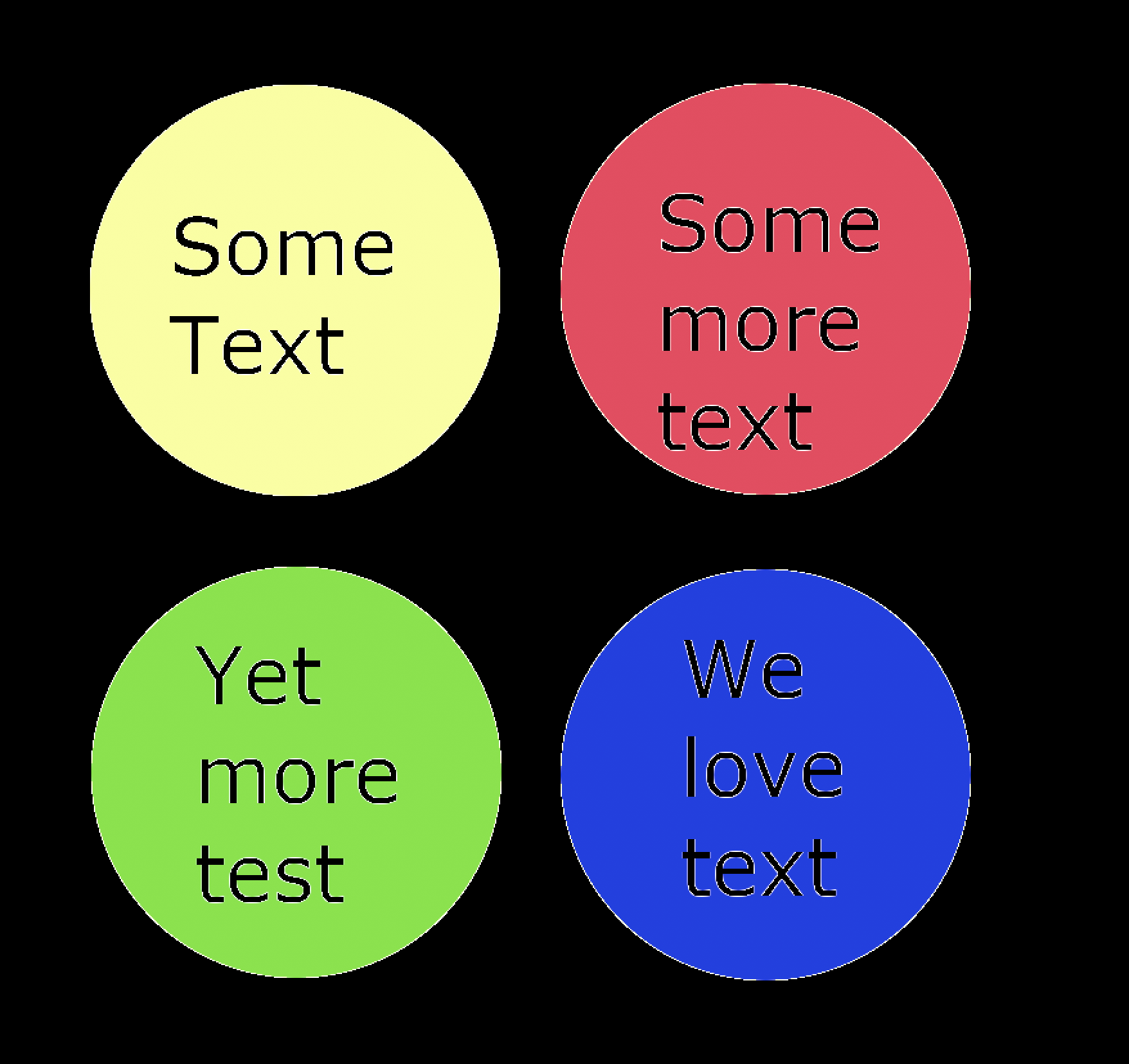
Having run the colour exchange we see

We can address the issue, by increasing the threshold tolerances
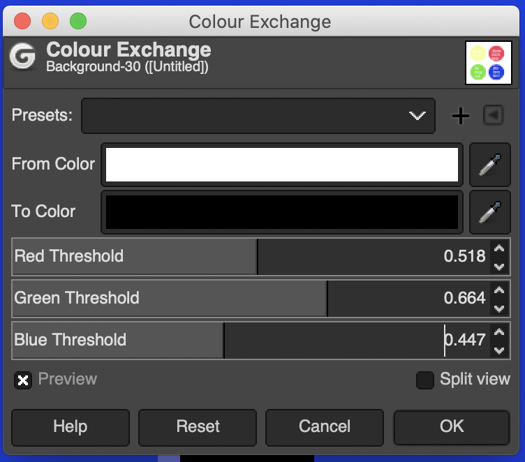
With the above thresholds set, we can see a vast improvement in the colour exchange

A little more tinkering with the threshold values will result in a cleaner exchange, not perfect by any means, but much better than our initial pass

Finally, we’ll want to apply the bucket fill tool to the background of the image to correct the background colour exchange
And with that, thanks for reading.